InDesign Trick!

Tutorial in English and German / Anleitung in Deutsch und Englisch

Deutsche Version siehe unten!
divider
English version:

Would you like to receive our tips for free in your e-mail box? Simply select FOLLOW to sign up with your e-mail address.

TIP OF THE WEEK: How to check on the separations for the printing press

All InDesign users who are sending their files to the printer, know the disappointment, when certain parts are being printed too dark which makes the details disappear.
The reason is simple: paper is like a sponge, which means more than 300% color is not possible for the paper to absorb.

Separations1

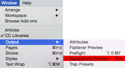
InDesign offers the Solution under MENU > WINDOW > OUTPUT > SEPARATIONS PREVIEW 300%. The parts which are higher as the allowed 300%, are shown in Indesign with this method! (see image below = the red marked parts are above 300%)

separations

we recommend opening the file again in Adobe Photoshop and lighten the red marked parts – save it – place the file again in Indesign or refresh the link!

face

divider

ALL tips of this Blog combined in one 72 pages PDF for easy download: i-adobe book in English – Preview & download here

divider

Deutsche Version:

Möchten Sie unsere gratis Tipps in Ihrem e-mail erhalten? Schreiben Sie sich unter FOLLOW mit Ihrer e-mail Adresse ein.

TIPP DER WOCHE: Wie man in InDesign den Farbauftrag für den Offsetdruck kontrollieren kann

Alle InDesign Benutzer die Ihre Dateien in den Druck schicken, kennen die Überraschung, wenn gewisse dunkle Bildstellen im Druck “absaufen”, d.h. zu dunkel gedruckt werden und die Details nicht mehr zu erkennen sind.
Der Grund ist einfach: Papier ist wie ein Schwamm, d.h. mehr als 300% Farbauftrag kann ein Papier nicht aufsaugen.

Farbauftrag1

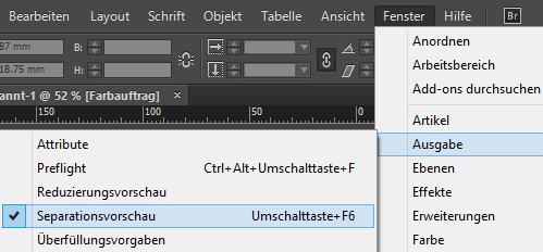
Die Lösung bietet InDesign unter MENU > FENSTER > AUSGABE > SEPARATIONSVORSCHAU 300%. Die Teile im Bild welche die erlaubten 300% übersteigen, werden damit in InDesign angezeigt! (siehe Foto unten = die Rot markierten Teile sind über 300%)

separationen

Wir empfehlen das Bild in Photoshop wieder zu öffnen und darauf achten, dass die rot markierten Stellen aufgehellt werden – danach wieder neu in InDesign platzieren oder erneut verknüpfen!

face

divider

Alle Tipps von diesem Blog kombiniert in einem 72-Seiten PDF zum herunterladen: i-adobe book in Deutsch – Vorschau & Download hier

divider

Advertisement

Black is not Black!

Info in English and German – Info in Deutsch und Englisch

English version:

Would you like to receive our tips for free in your e-mail box? Simply select FOLLOW to sign up with your e-mail address.

divider
TIP OF THE WEEK:
how to use BLACK!

Ever wondered why Black sometimes prints more like a dark grey?
This is our suggestion how to set set the right Black for the CMYK printing process:

To print large areas of Black we suggest using: 30 % Cyan, 20 % Magenta, 20 % Yellow and 100 % Black to print a neutral and deep Black. Some printers go as high as: 70c, 60m, 50y – ask your printer for details.

For fonts in general, especially if the type is thin and small: 100 % Black is fine. Is the Black font big in size, like a large, bold headline; you might add Cyan, Magenta and Yellow as mentioned above.

As for Registration Black: Please DO NOT use this for anything else than Registration marks. Why? Because it is: 100 % Cyan, 100 % Magenta, 100 % Yellow and 100 % Black (=Key), is used for registration marks only and goes way over the 300 % color limit.

In general: pay attention that you won’t go over the 300 % color limit, which is easy to check in InDesign under: WINDOW > OUTPUT > SEPARATIONS PREVIEW > the Ink Limit should not exceed 300 %)

Tip: as you may have noticed the “default” black of Photoshop is 75c 68m 67y 90k, which takes you to the 300% maximum total ink limit and also allows for a little ink dot gain or “spreading” at the press by lowering the black(Keyline) 10%

cheers – REEDesign

divider

Deutsche Version:

Möchten Sie unsere gratis Tipps im e-mail erhalten? Schreiben Sie sich unter FOLLOW mit Ihrer e-mail Adresse ein.

divider
TIPP DER WOCHE:
Wie man Schwarz korrekt einsetzt.

Haben sie sich jemals gewundert, warum schwarze Flächen als Dunkelgrau gedruckt werden? Hier ist unser Ratschlag, wie sie ihr Schwarz korrekt für den CMYK Druckprozess vorbereiten:

Um ein tiefes Schwarz bei grossen Flächen zu erhalten empfehlen wir: 30 % Cyan, 20 % Magenta, 20 % Yellow and 100 % Black. Einige Druckereien gehen sogar so hoch: 70c, 60m, 50y – fragen Sie Ihre Druckerei.

Für Schriften, vor allem klein in der Grösse und dünn: 100 % Black ist genügend. Ist die Schrift jedoch gross und Fett, könnte man Cyan, Magenta und Yellow dazugeben.

Das Passermarken-Schwarz ist mit 100 % Cyan, 100 % Magenta, 100 % Yellow und 100 % Black (=Key) über dem erlaubten 300% Farbauftrag und ist somit nur für Schnitt- und Passermarken gedacht.

Tipp: den 300 % Farbauftrag nicht überschreiten: InDesign prüft das unter: FENSTER > AUSGABE > Separationsvorschau > Farbauftrag.

cheers – REEDesign

One possible way to make a PDF-X using Adobe InDesign

Would you like to receive our tips for free in your e-mail box? Simply select FOLLOW to sign up with your e-mail address.

TIP OF THE WEEK:
One possible way to make a PDF-X using Adobe InDesign.

Under Edit > Convert to Profile choose your color profile – Important: ask your professional printer which color profile he needs!

1: Under File > Adobe PDF Presets > choose your PDF-X setting – Again: ask your printer which PDF-X he wants!
PDF_E2

2: Under General select single pages!
PDF_E3

3: Under Marks and Bleeds select crop marks and bleed setting!
PDF_E4

4: Under Output select your color profile (ask your printer)
PDF_E5

Additional Info for Europe: European Color Initiative

Additional Info for the United States: INTERNATIONAL COLOR CONSORTIUM