Adobe MUSE: create your own website!

Tutorial in English and German / Anleitung in Deutsch und Englisch

English Version:
Here are two new websites created with Adobe MUSE. It is a good choice for people who know InDesign but have zero knowledge on how to use any code. MUSE is part of the Adobe Creative Cloud Version. Users of CS6 should have the possibility to rent Adobe MUSE by itself for much less. MUSE is great for simple websites, similar to use like Adobe InDesign with masterpages, layers and links. Why not give it a try and use the test version?

www.selmi.net

SAMPLE / BEISPIEL WEBSITE: www.selmi.net

Reedesign.ch

SAMPLE / BEISPIEL WEBSEITE: www.reedesign.ch

divider

Direct link for more info about ADOBE MUSE

divider

Deutsche Version:
Oben sehen sie zwei neue Webseiten gestaltet mit Adobe MUSE. Es ist eine gute Wahl für Leute die InDesign kennen und keine Programmierkenntnisse haben. MUSE ist Teil der Adobe Creative Cloud Version. Benutzer/innen von CS6 sollten aber die Möglichkeit haben MUSE alleine zu mieten. Adobe MUSE ist super für einfache Webseiten und sehr ähnlich wie InDesign mit Musterseiten, Ebenen und Verknüpfungen. Warum nicht mal die Testversion ausprobieren?

muse

Direkter Link für mehr Info über ADOBE MUSE

MuseE

Make your Colors Global!

Tutorial in English and German – Anleitung in Deutsch und Englisch

Deutsche Version siehe unten!
divider

Would you like to receive our tips for free in your e-mail box? Simply select FOLLOW to sign up with your e-mail address.

divider

English version:

Have you ever tried to make an exact lighter version of a color you’ve chosen?
The answer is simple: Make your colors Global in Adobe Illustrator – in one simple step!
With this simple method, you can define a specific color as a Global and simply alter the percentage to keep the mixing ratio.

1. Open Adobe Illustrator and select your Swatches. (Window > Swatches)
Open one of the colors by double-clicking in the Swatch Library to open the Swatch Options.
Simply select the box “Global”! See image below.

Screen Shot 2014-03-16 at 2.45.39 PM

2. Open your Color (Window > Color) and choose the percentage you need.
There you can also choose your percentages for your spot colors (Pantone) if needed.

Screen Shot 2014-03-16 at 2.46.21 PM

divider

Möchten Sie unsere gratis Tipps im e-mail erhalten? Schreiben Sie sich unter FOLLOW mit Ihrer e-mail Adresse ein.

Deutsche Version:

Haben sie jemals versucht eine Farbe prozentual heller zu machen?
Die Antwort ist einfach: Machen sie ihre Farben Global in Adobe Illustrator – mit nur einem einfachen Schritt! Mit dieser einfachen Methode können Sie eine spezifische Farbe als Global definieren und prozentual heller machen um das Mischverhältnis zu erhalten.

1. Öffnen sie Adobe Illustrator und öffnen sie ihre Farbfelder. (Fenster > Farbfelder)
Wählen sie ihre Farbe und öffnen sie die Farbfeldoptionen mit einem Doppelklick.
Ganz einfach: klicken sie auf die Box “Global”! Siehe Bild unten.

Bildschirmfoto 2014-03-16 um 14.30.58

2. Öffnen sie ihr Farbe-Bedienfeld (Fenster > Farbe) und wählen die Prozente die sie wünschen.
Hier können sie auch für Volltonfarben (Pantone) ihre gewünschten Prozente angeben.

Bildschirmfoto 2014-03-16 um 14.31.39

Cool free Fonts in Adobe CC

Tutorial in English and German – Anleitung in Deutsch und Englisch
New Feature in Adobe Creative Cloud is the ability to download cool Fonts for free!
News für Adobe Creative Cloud Benutzer: Laden sie mit dem TYPEKIT gratis Schriften herunter!

TYPEKIT3

In 3 easy steps /
In drei einfachen Schritten:

Screen Shot 2014-02-09 at 6.09.49 PM

1. Simply click on your cloud symbol, click on TYPEKIT and login with your Adobe ID.
1. Klicken sie auf das Cloud Symbol oben in der Steuerung, wählen sie das TYPEKIT und logen sie mit ihrer Adobe ID ein.

typekit

2. The next window says it all! Have fun downloading the free fonts Creative Cloud provides!
2. Das nächste Fenster sagt alles: es ist ganz einfach die Fonts anzuschauen und herunterzuladen!

Screen Shot 2014-02-09 at 6.10.50 PM

Tip:
For older Adobe Versions, feel free to check out the following Tutorial, which also offers great possibilities in choosing free Fonts!
TUTORIAL > FREE COOL FONTS !

Tipp: Für ältere Adobe Versionen haben wir hier ein anderes Tutorial, wobei gezeigt wird wie man auch sonst zu coolen Gratis Schriften kommt!
TUTORIAL > COOLE GRATIS SCHRIFTEN !

Pixel is also Queen!

Info in English and German – Info in Deutsch und Englisch

English version:
Having just conducted an on-site training seminar at a former student’s corporate headquarters, we encountered another element of confusion in defining file size and/or resolution as needed for printing processes.

In case you are unable to view the file information in a program like Adobe InDesign or Illustrator that provides “effective PPI” info, or Photoshop which allows professional resizing methods, you can also mathematically “measure” a file.

Simply select the image file and click Command i (mac) or perform a “right click” with the mouse (pc) to view the file information for it’s pixel Width x pixel Height dimension i.e. (3000px x 3000px)

PixelFileInfo

Simply divide (/) these dimensions by the intended resolution – 300dpi (Pixel Per Inch) or 118dpc (Pixel Per Centimeter) for printing processes = 10 inch by 10 inch or 25.4 centimeter by 25.4 centimeter, which is the actual printed image size.

PixelPerInch

PixelPerCenti

DEUTSCHE Version:
Sollten sie keine dieser Programme wie Adobe InDesign oder Illustrator zur Verfügung haben” um die effektive PPI” information herauszufinden, oder Photoshop in welchem wir professionell die Bildgrösse ändern können, dann können sie auch “mathematisch die Grösse einer Datei messen”.

Ganz einfach: Klicken sie auf ihre Bilddatei und wählen die Tasten Command und i (Mac) oder “Rechtsklick” mit der Maus (PC) um die Pixel Breite x Pixel Höhe zu sehen (Unter Eigenschaften > Details). In unserem Beispiel: (3000px x 3000px)

PixelFileDeutsch

Teilen sie ganz einfach (/) diese Grösse mit ihrer Resolution für den Druckprozess – 300dpi (Pixel Per Inch = Zoll) oder 118dpc (Pixel per Zentimeter). Damit erhalten sie die richtige Druckgrösse = 10 Inch/Zoll x 10 Inch/Zoll oder 25.4 Zentimeter x 25.4 Zentimeter.

PixelPerZOLL

PixelPerZENT

Todays Concept: LOVE

To view the artists’s homage to love: VALENTINE 2

Image by Miriam Selmi Reed – Technique: Manual drawing, combined with Adobe CC.

MiriamSelmiReed

Image: Courtesy of Illustration Source.

Copyright by Illustration Source. All rights reserved.
15 East 32nd Street 7th Floor, New York, NY 10016 USA
Contact: sales@illustrationsource.com

Color Profiles / Farbprofile

Tutorial in English and German / Anleitung in Deutsch und Englisch

Deutsche Version siehe unten!

English Version:
Color profiles are necessary to maintain optimal color quality for both print and digital. The following is a brief overview for beginners in Adobe.

RGB = Red, Green and Blue color mode is based on light primarily for digital display and often used with the following color profile: sRGB. (Standard RGB). This profile ensures consistency across a wide range of monitors and displays for websites, apps, video-games, etc.

sRGB is also a preferred choice by many designers if your image will be used in office programs such as Microsoft Word and on the internet. The colors display correctly on the web, has the simplest workflow and looks fine in print. BUT! It has a smaller color space than ADOBE RGB. The latest trend: simply place jpgs, sRGB, 72 images into Indesign and let Indesign converting it into CMYK for the printing press when exporting the file into a print-ready PDF.

CMYK = Cyan, Magenta, Yellow and Key (Black) color mode is based on ink primarily for use with an actual printing press and will often require color profile and/or conversion provided by the printer.

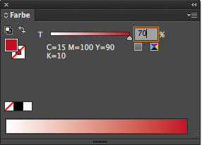
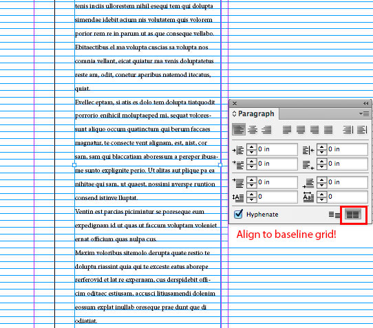
ASSIGN PROFILES: allows you to check how the colors react in your image. Assigning a color profile shows you the result, without changing the colors permanently. ASSIGN PROFILES is like putting a sticker on your image – if someone takes that sticker away, your image returns to the original setting. TIP: ASSIGN PROFILES is ideal to check how the your colors react to a different color profile.

Screen Shot 2014-02-20 at 4.18.53 PM

INFO: Changing the mode from RGB into CMYK in Photoshop is a crucial step. (RGBs contain approx. 16 millions of colors, CMYK approx. 4000 to 6000). Therefore, it is recommended to leave your Photoshop (psd) file in RGB as long as possible and keep all the layers, paths and masks.

Once your Photoshop (psd) file is completed; save out a PSD or Tiff copy and flatten it to one layer.

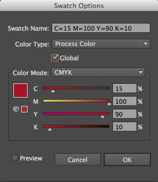
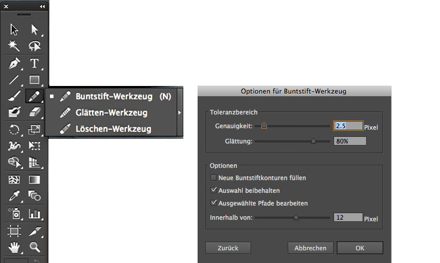
Step 2: Open your flattened Tiff file. Go to Menu > Edit > Convert to Profile and select your CMYK color profile. (In our case: FOGRA 39. To find out which color profile you should choose: contact your printer directly, as the correct color profile will depend on a number of variables including your paper choice, printing press and location!)

Screen Shot 2014-02-20 at 4.19.42 PM

CONVERT TO PROFILE: converts your colors permanently into another color profile!
The document will be converted to and tagged with this new profile.

Step 3: Make sure your Tiff has the correct resolution for print (300dpi) and place your Tiff file at 100% size into your Adobe InDesign Layout. (Enlarging or reducing a Tiff Image in InDesign will usually result in quality loss.)

Tip 1: Article on How to resize a pixel image
Tip 2: Article on How to make a PDF/X

IMPORTANT: to maintain color consistency throughout the entire Creative Suite Design programs, make sure you synchronise your Creative Suite Color settings in Adobe Bridge. Open Adobe Bridge and go to Menu > Edit > Creative Suite Color Settings. Click on the box “Show expanded List of Color Settings Files” and make your selection.

Additional info and download options for offset printing color profiles in Europe: European Color Initiative. Please download and install the archive ECI Offset 2009. In case you are not sure which ICC profile for offset printing to use, it is recommended to use ISO Coated v2 300% (ECI). it is crucial to keep yourself informed on the latest news by visiting this website if you’re working with European printing houses: www.eci.org .

Additional Info for color profiles in the United States: INTERNATIONAL COLOR CONSORTIUM

divider

Deutsche Version!

Farbprofile zu verstehen ist wichtig, um optimale Farbqualität im Druck oder Web zu erhalten. In diesem Tutorial diskutieren wir beides, aber auf einem Niveau für Anfänger.

RGB = Rot, Grün und Blau sind sogenannte additive Lichtfarben, werden für Monitore gebraucht und meistens im folgenden RGB Profil: sRGB. (Standard RGB) Dies ist eine kluge Wahl, solange man ein Bild für den Bildschirm benutzt, zum Beispiel für Webseiten, Apps, Videogames usw.

sRGB ist auch eine sichere Option, wenn du dein Bild in Office Programmen wie Microsoft Word benutzen und auf dem Internet zeigen möchtest. Adobe RGB hat einen grösseren Farbraum im Grün-Bereich, die Farben werden dadurch verstärkt auch im Kontrast, was beim Drucken je nach dem positiv sein kann, aber wird auf dem Internet deine Farben nicht korrekt zeigen.
Ein neuer Trend hier im deutschen Raum heisst: Medien-neutrales-Arbeiten Check it out!

CMYK = Cyan, Magenta, Yellow (Gelb) und Key (Schwarz) sind subtraktive Prozessfarben, die in einer professionelle Offsetdruckmaschine benutzt werden.

PROFILE ZUWEISEN: Ermöglicht die Auswahl eines anderen Profils. Die Anwendung weist dem Dokument das neue Profil zu, ohne die Farben in den Profilfarbraum zu konvertieren. Das Erscheinungsbild der Farben auf Ihrem Monitor kann sich dadurch erheblich verändern.

AdobeRGB

PROFIL ZUWEISEN WIE EINE ETIKETTE – wenn man diese wegnimmt kehrt das Bild wieder in den Ursprung zurück. TIPP: ZUWEISEN ist IDEAL um anzuschauen wie sich die Farben in einem anderen Farbprofil verhalten.

INFO: Der Moduswechsel von RGB zu CMYK in Photoshop ist ein heikler Punkt.
(RGB hat ca. 16 Millionen von Farben, CMYK nur ca. 4000 bis 6000). Darum ist es empfohlen das Photoshop (psd) Dokument in RGB zu lassen und alle Ebenen, Pfade und Masken zu behalten.

Sobald du mit dem Bearbeiten ihres Photoshop (psd) Dokuments fertig bist, speicherst du eine PSD oder Tiff Kopie und reduzierst es auf eine Ebene.

2. Öffne deine Tiff Datei. Geh zum Menu > Bearbeiten > in Profil umwandeln und wählen dein CMYK Farbprofil für deine Tiff Datei. (In unserem Fall: FOGRA 39. Um das korrekte Farbprofil zu erfahren: frag unbedingt deine Offset-Druckerei, denn das korrekte Farbprofil hängt vom Papier, der Druckmaschine und dem Land ab!)

Fogra39

IN PROFIL UMWANDELN: Konvertiert die Dokumentfarben in ein anderes Profil!
D.h. du rechnest die Farbwerte in den anderen Farbraum um. Das gewählte FARBPROFIL wird mit diesem Befehl permanent umgewandelt.

3. Vergewissere dich, dass dein Tiff Bild die korrekte Resolution für den Druck aufweist (300dpi) und platziere dein Tiff zu 100 % Grösse in dein Adobe InDesign Layout. (Vergrössern oder verkleinern eines Tiff Bildes in InDesign kann auch Qualitätsverlust erzeugen).

Tipp 1: Artikel Wie man ein Pixel Bild vergrössert oder verkleinert
Tipp 2: Artikel Wie man ein PDF-X für die Druckerei erstellt

WICHTIG: Um die Farbprofile in allen Creative Suite Design Programme konsistent zu halten, ist es wichtig die Creative Suite Farbeinstellungen in Adobe Bridge zu synchronisieren . Öffne dein Adobe Bridge Programm und gehe zum Menu > Bearbeiten > Creative Suite-Farbeinstellungen. Wähle dann die Box “Erweiterte Liste mit Farbeinstellungsdateien anzeigen” und dein gewünschtes Farbprofil.

Um deine gewünschten Farbprofile für den Offsetdruck herunterzuladen und mehr Informationen – findest du hier der Link zur Webseite > European Color Initiative.
Tipp: Die ECI Offset 2009 Farbprofile herunterladen und installieren. Im Zweifelsfall ist das ISO Coated v2 300% (ECI) das richtige Farbprofil. Es ist wichtig, sich immer via www.eci.org auf dem neuesten Stand zu halten.
Gratis Leitfaden für die Erstellung von PDF-X: PDF-X READY LEITFADEN

Today’s Concept: Be My Valentine

To view the artists’s homage to love: BE MY VALENTINE

Images by Miriam Selmi Reed – Technique: Manual drawing, combined with Adobe CC.

Miriam Selmi Reed

Miriam Selmi Reed

Courtesy of Illustration Source.

Copyright by Illustration Source. All rights reserved.
15 East 32nd Street 7th Floor, New York, NY 10016 USA
Contact: sales@illustrationsource.com

Promote your own Work! Ihr eigenes Gratis online Portfolio!

Good news! if you already have CC (Creative Cloud), check out this free service: your own online portfolio www.behance.net. This is our example: www.behance.net/MReed

Falls Sie bereits CC (Creative Cloud) haben, könnte Sie diesen Gratis Service interessieren: Ihr eigenes online Portfolio auf www.behance.net. Dies ist unser Beispiel: www.behance.net/MReed

Totally new: Your Behance Portfolio for your IPad or IPhone!
Ganz neu: Ihr Behance portfolio neu auch auf ihrem IPad oder IPhone!

Behance
If you are renting CC from Adobe on a monthly basis, you may even have the service PROSITE included, an easy way to get your own website going. Our example: mreed.prosite.com

Falls Sie CC von Adobe monatlich mieten, sollte der service von PROSITE inklusive sein, ein simpler Weg Ihre eigene gratis Webseite zu erstellen. Unser Beispiel: mreed.prosite.com

As with every Blog or WordPress Site you may choose from Templates and change fonts as well as colors. You don’t need any programing skills. To upload images is as easy as adding an attachment to your e-mail.

Wie mit jedem Blog oder WordPress Webseite können Sie Layoutvorlagen auswählen, Schriften und Farben ändern. Man braucht dazu absolut keine Programmierkenntnisse.

If you already have CC or are thinking about upgrading, you might look into BEHANCE and PROSITE to advertise your work!

Falls Sie bereits CC haben oder daran denken zu upgraden: es könnte sich lohnen BEHANCE und PROSITE zu benutzen um Ihre Arbeiten zu zeigen!

Wie man mit Illustrator zeichnet

Möchten Sie unsere gratis Tipps im e-mail erhalten? Schreiben Sie sich unter FOLLOW mit Ihrer e-mail Adresse ein.

divider

Adobe Illustrator ist in erster Linie ein Programm um Zeichnungen und Logos/Signete zu erstellen. Das Programm besteht nicht aus Pixel, sondern ist ein Vektor-Programm in welchem mit Ankerpunkten gearbeitet wird.

Das Zeichenstift-Werkzeug ist dazu ideal, denn es zeichnet Pfade mit Ankerpunkten:
Mit einem einfachem KLICK mit der Maus wird ein eckiger Ankerpunkt gesetzt, zieht man aber während dem KLICKEN mit der Hand und drückt weiterhin die Maus, entstehen Ankerpunkte mit Hebel, mit denen Rundungen möglich sind.

Das Zeichenstift-Werkzeug ist ideal um Flächen zu zeichnen. Ganz einfach: Ankerpunkte setzen und eine Form zeichnen bis man wieder zum ersten Ankerpunkt kommt, die Fläche abschliessen und eine Flächenfarbe wählen.

ZeichenstiftWerkzeug

Video Tutorial für Anfänger:

Der Buntstift zeichnet Linien die man mit dem Breitenwerkzeug gut kombinieren kann.
Die Optionen zum Bunstift: DOPPELKLICK auf den Buntstift in der Werkzeug-Leiste.

Der Buntstift zeichnet offene Pfade und ist ideal für Linien. Möchte man mit dem Buntstift eine Fläche zeichnen, müssen am Schluss die Ankerpunkte am Ende der Form zusammengefügt werden. Menü > Objekt > Pfad > Zusammengefügen oder per Kurzbefehl: ctrl+J für PC / command+J für Mac.

Buntstift-Werkzeug

Video Tutorial für Anfänger:

Das Breitenwerkzeug in Adobe Illustrator CS6 ist ideal um einer simplen Linie einen Pinsel-Charakter zu geben: die Linie anklicken und mit der Maus ZIEHEN bis die Linie breiter wird.

BreitenwerkzeugTool

Der Buntstift und das Zeichenstift-Werkzeug sind ideal um genaue Konturen zu zeichnen, mit dem Breitenwerkzeug kann man einen Pinsel imitieren. Aber um malerische Effekte mit Strukturen zu erzeugen wie z.B, Aquarell, eignet sich jedoch der Pinsel besser. Die Optionen dazu kann man unter Menü > Fenster > Pinsel holen. Im selben Bedienfeld findet man unten links das Icon für die Adobe Pinsel-Bibliothek, die man frei benutzen kann.

PinselOptionen

Wie man eigene Pinsel erstellen kann oder bestehende Pinsel ändern, folgt in einem späteren Tutorial.
FOLLOWERS von i-adobe.com erhalten jedes neue Tutorial automatisch per e-mail.

divider

Weitere Lernvideos für Fortgeschrittene:
Zeichnen mit Illustrator für Fortgeschrittene

How to draw in Illustrator

Would you like to receive our tips for free in your e-mail box? Simply select FOLLOW to sign up with your e-mail address.

divider

Adobe Illustrator is primarily a vector based design tool to draw clean shapes and to create resizable Logos. Whereas Photoshop is raster based and therefore pixel dependent, Illustrator is using vector shapes made out of anchor points.

Therefore the Pen Tool in Illustrator is ideal to draw paths with anchor points:
With a simple mouse CLICK, you are setting corner anchor-points. If you are clicking AND dragging with the mouse at the same time, you’ll get round anchor-points with levers, with those are round corner points and curves possible.

The Pen Tool is ideal to draw closed shapes. It’s easy! Draw your shape while setting your points until you reach the first anchor-point again; select it to close the shape and choose a fill color.

PenTool

Video Tutorial for beginners:

The Pencil Tool draws lines which you can combine with the Width Tool.
To open the options for the Pencil Tool: Double click the Pencil Tool icon in the tool sidebar. The same way you may open the Brush options if needed.

The Pencil Tool is ideal to draw lines. If you do need to close the open path into a shape;
you either have to select both end-points and go under Menu > Object > Path > Join or use the shortcut ctrl+J for PC / command+J for Mac.

pencilTool

Video Tutorial for beginners:

The Width Tool in Adobe Illustrator CS6 is ideal to give your line a Brush stroke character: select the line and drag with the mouse until the line becomes wider.

WidthTool

The Pen Tool and Pencil Tool are both ideal to draw clean shapes and lines. The Width Tool can help to simulate a brush line. Although to achieve structures and water color effects; the Brush Tool would be a better choice!

The Brush Tool and its options are easily to find under Menu > Window > Brushes.
On the bottom of the Brush-Option, you may find the icon for the Adobe Brush Library with all kinds of artistic brushes.

Brushes

How to create your own Brushes or alter existing Brushes in the Adobe Library, will be shown in a future tutorial.
I-Adobe FOLLOWERS are going to receive updates on this topic automatically by e-mail.

divider

Additional tutorials for advanced users:
Drawing in Illustrator for advanced users

Today’s Concept

Image by Miriam Selmi Reed. Courtesy of Illustration Source.

Courtesy of Illustration Source.

Go to > Today’s Concept: Give me the Keys

Image by Miriam Selmi Reed. Courtesy of Illustration Source.

Copyright by Illustration Source. All rights reserved.
15 East 32nd Street 7th Floor, New York, NY 10016 USA
Contact: sales@illustrationsource.com

Interactive PDF in Adobe InDesign

Tutorial in English and German / Anleitung in Deutsch und Englisch

English version:

Would you like to receive our tips for free in your e-mail box? Simply select FOLLOW to sign up with your e-mail address.

TIP OF THE WEEK: How to create an Interactive PDF in Adobe InDesign.

Many people ask us if it is possible to use InDesign like Power Point. The answer is simple: make an interactive PDF!

1. Open Adobe InDesign CS6 or CC

2. Design your layout with several single pages

OPTION: Under Window > Interactive; you might find possibilities like Hyperlinks etc.

TIP: Under Window > Pages; click on the top right drop-down arrow, go look into the Page Attributes > Page Transitions > Choose, there you can see a PREVIEW of the cool page transitions InDesign has to offer.

pagetransitionsFINAL

3. Export your interactive PDF. File > Export > Format: Adobe PDF (Interactive); as you can see you can also choose your Page Transitions there! Important: choose Image Handling and your correct Resolution.

interactivePDF

Open Acrobat and enjoy the show!

divider

Deutsche Version:

Möchten Sie unsere gratis Tipps im e-mail erhalten? Schreiben Sie sich unter FOLLOW mit Ihrer e-mail Adresse ein.

TIPP DER WOCHE: Wie man ein Interaktives PDF mit Adobe InDesign erstellt.

Viele Leute fragen uns immer wieder ob man InDesign wie Power Point benutzen kann. Die Antwort ist einfach: machen Sie ein interaktives PDF!

1. Öffnen Sie Adobe InDesign CS6 oder CC

2. Gestalten Sie Ihre Präsentation mit mehreren Einzelseiten.

OPTION: Unter Fenster > Interaktiv; finden Sie Möglichkeiten wie z.B. Hyperlinks zu Webseiten usw.

TIPP: Unter Fenster > Seiten; im Seitenbedienfeld klicken Sie oben rechts auf den Pfeil, dort finden Sie die Seitenattribute > Seitenübergänge > Wählen, wo man eine VORSCHAU der Seitenübergänge anschauen kann die InDesign offeriert.

pagetransitionsFINAL

3. Exportieren Sie Ihr Interaktives PDF. Datei > Exportieren > Format: Adobe PDF (Interaktive).
Sie können auch dort Ihre Seitenübergänge wählen!
Wichtig: wählen Sie Ihre gewünschte Bildhandhabung und korrekte Auflösung.

interactivePDF

Öffnen Sie Ihr Adobe Acrobat und geniessen Sie Ihre Präsentation!

Create patterns / erstellen von Mustern in Illustrator

Tutorial in English and German / Anleitung in Englisch und Deutsch

Deutsche Version siehe unten!
divider

English version:

Open a new document in Adobe Illustrator CS6 or CC:

1. Go to MENU > OBJECT > PATTERN > MAKE.
Create your pattern inside the blue box. Illustrator is going to create your pattern as a repeat automatically.

pattern

2. Once you are done, simply select the DONE button, this way Illustrator adds the pattern (repeat) into your Swatch Library. Now you can fill your fashion silhouette or object with your pattern.

Print

3. To make a change to your newly created pattern: Go to OBJECT > PATTERN > EDIT PATTERN. Make your changes and click on DONE if you like to save over the old pattern or click on SAVE A COPY in case you like to add a new swatch and keep the previous one.

For more tips watch the step-by-step Tutorial:

divider

Deutsche Version:

Öffnen Sie ein neues Dokument in Adobe Illustrator CS6 oder CC:

1. Gehen Sie zu MENÜ > OBJEKT > MUSTER > ERSTELLEN. Illustrator erstellt automatisch ihr Muster als Rapport innerhalb des blauen Rahmens.

muster

2. Sobald Sie mit Ihrem Muster fertig sind, klicken Sie oben auf FERTIG. Damit wird Ihr Muster (Rapport) in Ihr Farbfeld-Bedienfeld eingefügt. Jetzt können Sie Ihr Muster in Ihr Objekt oder Illustration als Flächefarbe einfüllen.

3. Falls Sie Ihr Muster ändern möchten: Gehen Sie zu OBJEKT > MUSTER > MUSTER BEARBEITEN. Klicken Sie auf FERTIG wenn Sie das alte Muster überspeichern wollen oder klicken Sie auf KOPIE SPEICHERN wenn Sie es als neues Muster speichern wollen.

Schritt-für-Schritt Anleitung auf Englisch mit deutschen Untertitel:

Featured Concept : Government

MiriamSelmiReed
Illustrated by Miriam Selmi Reed – Mixed digital & traditional media

We invite you to view how our artists show the Government’s role in our lives.
Illustration Source provides you with speed and convenience. The artists represented by Illustration Source are some of the best illustrators working today.

Go to > Featured Concept ; Government

Copyright 2013 Illustration Source. All rights reserved.
15 East 32nd Street 7th Floor, New York, NY 10016 USA
email: sales@illustrationsource.com

Renewal – The new year is a perfect time to set new goals

Mixed media

Illustrationsource.com

Go to > Featured Concept ; Renewal

Illustrated by Miriam Selmi Reed –
Mixed media: Pencil, charcoal, Illustrator and Photoshop.

Copyright 2013 Illustration Source. All rights reserved.
15 East 32nd Street 7th Floor, New York, NY 10016 USA
email: sales@illustrationsource.com

Passen Sie Ihren Text magnetisch am Grundlinienraster an!

Deutsche Version:

Möchten Sie unsere gratis Tipps im e-mail erhalten? Schreiben Sie sich unter FOLLOW mit Ihrer e-mail Adresse ein.

divider

TIPP DER WOCHE: Passen Sie Ihren Text magnetisch am Grundlinienraster an.

Der Grundlinienraster bei Adobe InDesign ist perfekt um Ihren Text darauf magnetisch auszurichten!

Hier die 4 einfachen Schritte wie man den Raster auf den Zeilenabstand des Textes ausrichtet und Ihren Grundlinienraster nach Wunsch anpassen kann:

Schritt 1: Öffnen Sie InDesign und bestimmen Ihre Dokumentvorgaben, unter Ränder bestimmen Sie Ihren Abstand von oben (in unserem Fall 24mm):

1

Schritt 2: Ziehen Sie einen Textrahmen auf und füllen diesen mit Platzhaltertext. Bestimmen Sie zusätzlich Ihre Schrift nach Wahl sowie den Zeilenabstand (in unserem Fall 16 Punkt). Gehen Sie zu Fenster > Ansicht > Raster & Hilfslinien > Grundlinienraster einblenden.

2

Schritt 3: Wählen Sie Ihren Text mit dem Textwerkzeug an und gehen zum Absatzbedienfeld. Dort wählen Sie die Funktion An Grundlinienraster ausrichten.
Dieselbe Funktion finden Sie wenn Sie ein neues Absatzformat erstellen.

3

Schritt 4: Wählen Sie Ihre Voreinstellungen und verändern unter Raster die Einstellungen entsprechend Ihren Layoutvorgaben die Sie vorher gewählt haben. (PC: Menü > Bearbeiten > Voreinstellungen / Mac: Menü > InDesign > Voreinstellungen).
Bei Anfang wählen Sie denselben Rand von oben den sie am Anfang beim erstellen des Dokuments gewählt haben (in unserem Fall 24mm). Unter Einteilung alle: den Zeilenabstand den Sie voher gewählt haben (in unserem Fall 16 Punkt).

4

Sobald Sie OK klicken passt sich der Grundlinienraster Ihrem Zeilenabstand an!

divider

Unser neues i-adobe book ist erhältlich online – in Deutsch – inklusive Tutorials auf 72 Seiten – Vorschau & Download hier!

i-Adobe interactive book / Cover illustration: Michael Alan Reed

i-Adobe interactive book / Cover illustration: Michael Alan Reed

divider

InDesign: Align your text to your baseline grid!

English version:

Would you like to receive our tips for free in your e-mail box? Simply select FOLLOW to sign up with your e-mail address.

divider

TIP OF THE WEEK: Align your text to your baseline grid!

The Baseline Grid in Adobe InDesign is perfect to align your text!

Here are the 4 easy steps to align your text to the Baseline Grid and alter the grid in your InDesign > Preferences:

Step 1: Open a document in InDesign and choose your presets; under Margins select you border from the Top as you wish:

1E

Step 2: Select the Type Tool, draw a text frame and fill it with Placeholder Text. Select your font type as well as your Leading. Go to View > Grids & Guides > Show Baseline Grid.

2E

Step 3: Select your text with the type tool and go to Window > Type & Tables > Paragraph. There you select the function Align to Baseline Grid.
You’ll find the same option when you create a new Paragraph Style.

3E

Step 4: Go to your InDesign Preferences and select Grids: the settings are the same as you’ve chosen previously. Under Start, you select the same Margins from the Top and under Increment Every the same Leading you’ve already chosen for your text. For PC the Preferences can be found under Edit > Preferences / Mac: InDesign > Preferences.

Def4E

As soon as you click OK, your Baseline Grid will automatically adjust to your leading!

divider

Our new i-adobe book is available online – in English – including tutorials on 72 pages – Preview & download here!

i-Adobe interactive book / Cover illustration: Michael Alan Reed

i-Adobe interactive book / Cover illustration: Michael Alan Reed

divider

happy holidays

Wir wünschen allen Kunden, Freunden und Verwandten frohe Festtage und “ein super 2014”!
We wish all our clients, friends and relatives happy holidays and a splendid 2014!

2013Karte

Creative font solutions – Kreatives Gestalten mit Schriften

Tutorial in English and German / Anleitung in Deutsch und Englisch

English version:

Would you like to receive our tips for free in your e-mail box? Simply select FOLLOW to sign up with your e-mail address.

divider

TIP OF THE WEEK: Creative font solutions!

Illustrator trick: “Create Outline” font option and “Compound Path Release”

1. Download a fancy free* font at dafont.com

2. In our case the font is from the Category > Fancy > Distorted. You can type your text into the PREVIEW field to see how it looks.

Screen Shot 2013-12-22 at 11.04.22 AM

3. Select your font with the Selection Tool and go to TYPE > “Create Outlines”.

4. With the “Compound Path Release” option, you can release the paths and colorize individual parts of each letter separately.

Tutorial spoken in German & English:

*IMPORTANT: Be aware that not every font is for free! Read the information before you hit the DOWNLOAD button. Donationware > Donate to author should be taken seriously. Free for personal use should not be used for commercial purposes.

divider

Deutsche Version:

Möchten Sie unsere gratis Tipps im e-mail erhalten? Schreiben Sie sich unter FOLLOW mit Ihrer e-mail Adresse ein.

divider

TIPP DER WOCHE: Kreatives Gestalten mit Schriften!

Illustrator trick: “Schrift in Pfade umwandeln” und “Zusammengesetzter Pfad zurückwandeln”

1. Laden Sie eine coole gratis* Schrift von dafont.com herunter.

2. In unserem Fall ist die Schrift von der Kategorie > Fancy > Distorted. Sie können Ihren Text ins PREVIEW Feld tippen um eine Vorschau zu sehen.

Screen Shot 2013-12-22 at 11.04.22 AM

3. Wählen Sie Ihre Font mit dem Auswahlwerkzeug an und gehen unter SCHRIFT > “in Pfade umwandeln”.

4. Mit der Option “Zusammengesetzter Pfad zurückwandeln” kann man die Verknüpfung aller Pfade lösen und jeder Teil innerhalb des Buchstaben einzeln einfärben.

Schritt für Schritt Anleitung auf Deutsch und Englisch:

*WICHTIG: Nicht jede Schrift ist Gratis! Bevor Sie auf den DOWNLOAD Knopf klicken, sollten Sie die Bedingungen genau lesen. Donationware > Donate to author heisst; dass man dafür auch bezahlen sollte. Free for personal use; die Schrift sollte nicht für kommerzielle Zwecke benutzt werden.

Create your own Website with Adobe MUSE!

Tutorial in English and German / Anleitung in Deutsch und Englisch

English version:

Would you like to receive our tips for free in your e-mail box? Simply select FOLLOW to sign up with your e-mail address.

divider

TIP OF THE WEEK: Create your own Website with Adobe MUSE!

With an InDesign background, you should be able to create your own Website with Adobe MUSE even without any knowledge of HTML or CSS.

You can even create your HERO Banner with Adobe Muse!

Website created with Adobe MUSE: www.selmi.net

Website created with Adobe MUSE: www.reedesign.ch

MUSE is part of the Adobe Creative Cloud! If you have a lower version such as CS6, you might be able to download the MUSE app for a low fee.

muse

As with InDesign, you can simply use master pages and layers. Once you are done with your webdesign, you can either choose Preview or Export as HTML and upload the data to your FTP server.

MuseE

divider

Deutsche Version:

Möchten Sie unsere gratis Tipps im e-mail erhalten? Schreiben Sie sich unter FOLLOW mit Ihrer e-mail Adresse ein.

TIPP DER WOCHE: Erstellen Sie Ihre eigene Webseite mit Adobe Muse!

Sollten Sie InDesign kennen, können Sie Ihre nächste Webseite auf einfache Weise mit Adobe MUSE gestalten auch ohne Programmierkenntnisse.

Sie können sogar ein Hero-Banner mit Adobe MUSE erstellen!

Website created with Adobe MUSE: www.selmi.net

Website created with Adobe MUSE: www.reedesign.ch

MUSE ist Teil der Adobe Creative Cloud! Es sollte aber auch möglich sein, das MUSE App einzeln bei Adobe herunterzuladen.

muse

Es funktioniert einfach: wie in InDesign können Sie Mustersteiten und Ebenen verwenden. Wenn Sie mit Ihrem Design fertig sind, können Sie entweder Vorschau oder Export als HTML anwählen und dann auf Ihren FTP server laden.

MuseE